フレックスボックスのレイアウトパターン
CSSのフレックスボックス「display: flex;」を使うと、HTML要素を様々なレイアウトで並べることができます。
今回はこのフレックスボックスを使ったレイアウトパターンを紹介していきます。
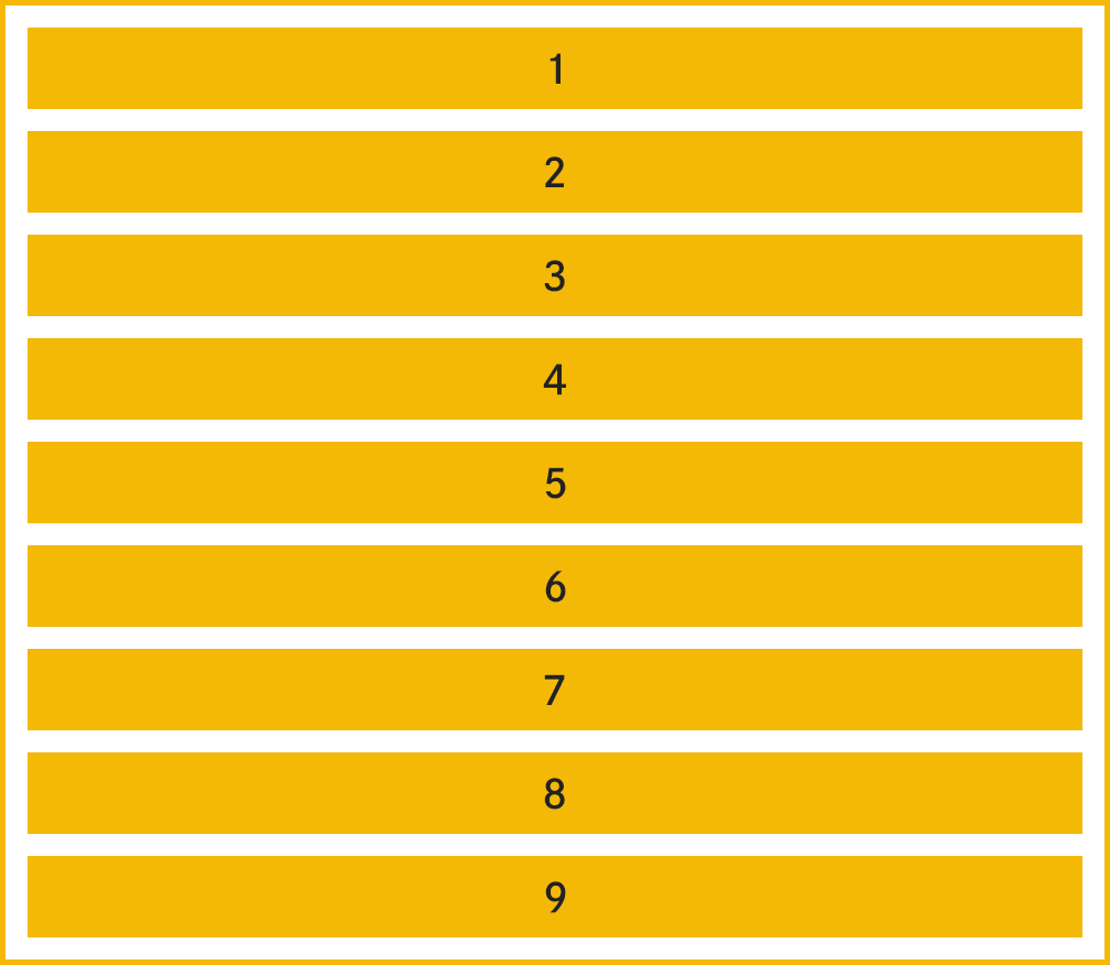
パターン1 横並び

パターン2 横並び

パターン3 横並び
パターン4 親要素の幅にあわせて均等配置
パターン5 親要素の幅にあわせて余白を調整して配置

パターン6 余白が均等になるように配置

パターン7 親要素の幅にあわせて自動改行して配置

パターン8 横並び(親要素の幅いっぱいになったら成り行き)

パターン9 横並び(親要素の幅いっぱいになったら自動改行)
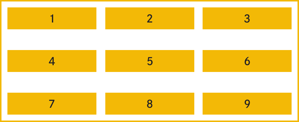
パターン10 子要素の幅を指定(1行に3つずつ配置)
パターン11 逆順(親要素の幅いっぱいになったら成り行き)

パターン12 縦方向の並びを逆順
パターン13 横方向&縦方向の並びを逆順
パターン14 3の倍数の要素だけ幅いっぱい表示
パターン15 要素を指定した順番で並び替え
パターン16 縦並び
パターン17 縦並び(逆順)
パターン18 アイテムを上下左右4隅に配置
パターン19 親要素の高さにあわせて均等配置
パターン20 親要素の高さにあわせて余白を調整して配置
パターン21 縦軸の余白が均等になるように配置
パターン22 アイテムを中央配置

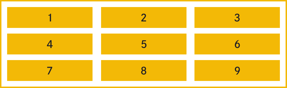
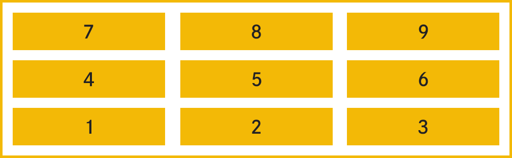
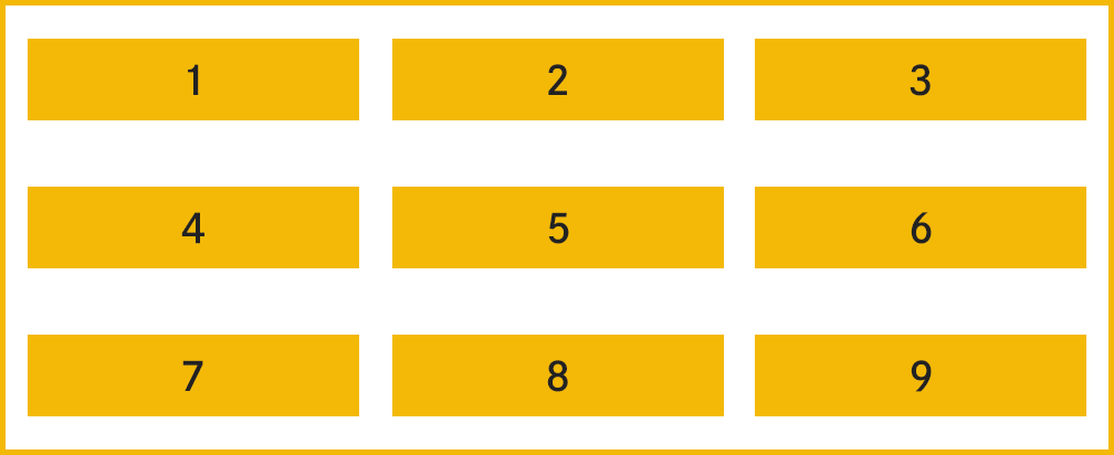
パターン1 横並び
親要素のsection要素に対して「display: flex;」を適用したシンプルなフレックスボックスです。
フレックスボックス内のフレックスアイテム(子要素)が横並びになります。
index.html
<section>
  <article>
    <p>1</p>
  </article>
  <article>
    <p>2</p>
  </article>
  <article>
    <p>3</p>
  </article>
</section>
style.css
section {
display: flex;
margin: 0 auto;
padding: 20px;
width: 1000px;
border: 4px solid #f2b82c;
}
article {
margin-right: 3%;
padding: 20px 5%;
width: 20%;
box-sizing: border-box;
text-align: center;
background: #f2b82c;
}
article:nth-child(3n) {
margin-right: 0;
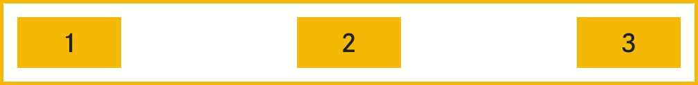
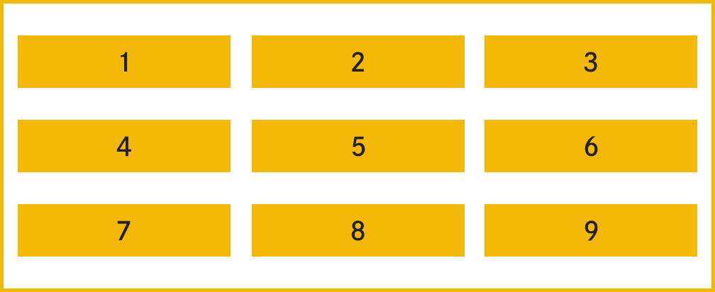
}パターン2 中央寄せ
親要素のsection要素に対して「display: flex;」を適用し、justify-contentプロパティでフレックスアイテムの配置を中央寄せに指定したフレックスボックスです。
フレックスアイテムが親要素に対して中央寄せで並びます。
index.html
<section>
  <article>
    <p>1</p>
  </article>
  <article>
    <p>2</p>
  </article>
  <article>
    <p>3</p>
  </article>
</section>
style.css
section {
  display: flex;
  margin: 0 auto;
  padding: 20px;
  width: 1000px;
  justify-content: center;
  border: 4px solid #f2b82c;
}

article {
  margin-right: 3%;
  padding: 20px 5%;
  width: 20%;
  box-sizing: border-box;
  text-align: center;
  background: #f2b82c;
}

article:nth-child(3n) {
  margin-right: 0;
}justify-contentプロパティは中央寄せの他に、以下の値で配置を指定することができます。
| 値 | フレックスアイテムの配置 |
|---|---|
| normal | 通常の配置 |
| start | 先頭に寄せる |
| end | 末尾に寄せる |
| flex-start | 先頭に寄せる |
| flex-end | 末尾に寄せる |
| left | 左に寄せる |
| right | 右に寄せる |
| center | 中央に寄せる |
| space-between | 親要素の幅に対してフレックスアイテムを均等に配置。最初のアイテムは先頭寄せ、末尾のアイテムは末尾寄せになる。 |
| space-around | 先頭と末尾のアイテムの余白が、アイテム同士の余白幅の半分になるように配置。 |
| space-evenly | 各フレックスアイテムの余白が均等になるように配置。 |
パターン3 右寄せ
親要素のsection要素に対してフレックスアイテムを末尾に寄せて配置します。
テキストの向きが日本語や英語のように左から右に向かう場合は右寄せ、反対の向きの言語では左寄せになります。
テキストの向きに関係なく右寄せにしたいときは「right」を指定します。
index.html
<section>
  <article>
    <p>1</p>
  </article>
  <article>
    <p>2</p>
  </article>
  <article>
    <p>3</p>
  </article>
</section>
style.css
section {
display: flex;
margin: 0 auto;
padding: 20px;
width: 1000px;
justify-content: flex-end;
border: 4px solid #f2b82c;
}
article {
margin-right: 3%;
padding: 20px 5%;
width: 20%;
box-sizing: border-box;
text-align: center;
background: #f2b82c;
}
article:nth-child(3n) {
margin-right: 0;
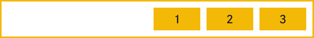
}パターン4 親要素の幅にあわせて均等配置
親要素のsection要素に対してフレックスアイテムを均等に配置します。
最初のアイテムは先頭寄せ、末尾のアイテムは末尾寄せになります。
index.html
<section>
  <article>
    <p>1</p>
  </article>
  <article>
    <p>2</p>
  </article>
  <article>
    <p>3</p>
  </article>
</section>
style.css
section {
  display: flex;
  margin: 0 auto;
  padding: 20px;
  width: 1000px;
  justify-content: space-between;
  border: 4px solid #f2b82c;
}

article {
  margin-right: 3%;
  padding: 20px 5%;
  width: 20%;
  box-sizing: border-box;
  text-align: center;
  background: #f2b82c;
}

article:nth-child(3n) {
  margin-right: 0;
}
パターン5 親要素の幅にあわせて余白を調整して配置
親要素にjustify-contentプロパティのspace-aroundを指定すると、親要素の幅に対して、先頭と末尾の余白をアイテム同士の余白の半分のサイズになるように自動調整して配置します。
index.html
<section>
  <article>
    <p>1</p>
  </article>
  <article>
    <p>2</p>
  </article>
  <article>
    <p>3</p>
  </article>
</section>
style.css
section {
  display: flex;
  margin: 0 auto;
  padding: 20px;
  width: 1000px;
  justify-content: space-around;
  border: 4px solid #f2b82c;
}

article {
  margin-right: 3%;
  padding: 20px 5%;
  width: 20%;
  box-sizing: border-box;
  text-align: center;
  background: #f2b82c;
}
パターン6 余白が均等になるように配置
親要素にjustify-contentプロパティのspace-evenlyを指定すると、親要素の幅に対して、アイテム間の余白が全て均等になるように配置します。
index.html
<section>
  <article>
    <p>1</p>
  </article>
  <article>
    <p>2</p>
  </article>
  <article>
    <p>3</p>
  </article>
</section>
style.css
section {
  display: flex;
  margin: 0 auto;
  padding: 20px;
  width: 1000px;
  justify-content: space-evenly;
  border: 4px solid #f2b82c;
}

article {
  margin-right: 3%;
  padding: 20px 5%;
  width: 20%;
  box-sizing: border-box;
  text-align: center;
  background: #f2b82c;
}
パターン7 親要素の幅にあわせて自動改行して配置
親要素にflex-wrapプロパティでwrapを指定し、アイテムの並びが親要素の幅いっぱいになったときに自動改行します。
フレックスアイテムの配置自体はパターン4と同様に均等配置ですが、今回はアイテムでも1行あたりに2つずつ並べるようにwidthプロパティを1つあたり48%、margin-rightプロパティを4%に指定し、合計した幅が100%(48% + 4% + 48%)となるようにしています。
index.html
<section>
  <article>
    <p>1</p>
  </article>
  <article>
    <p>2</p>
  </article>
  <article>
    <p>3</p>
  </article>
  <article>
    <p>4</p>
  </article>
</section>
style.css
section {
display: flex;
margin: 0 auto;
padding: 20px;
width: 1000px;
flex-wrap: wrap;
justify-content: space-between;
border: 4px solid #f2b82c;
}
article {
margin-right: 4%;
margin-bottom: 20px;
padding: 20px 5%;
width: 48%;
box-sizing: border-box;
text-align: center;
background: #f2b82c;
}
article:nth-child(2n) {
margin-right: 0;
}
article:nth-child(3),
article:nth-child(4) {
margin-bottom: 0;
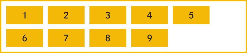
}パターン8 横並び(親要素の幅いっぱいになったら成り行き)
親要素にflex-wrapプロパティでwrapを指定せず、アイテムが親要素の幅いっぱいになったときの表示です。
自動改行せず、成り行きでフレックスアイテムが横に並び続けます。
index.html
<section>
  <article>
    <p>1</p>
  </article>
  <article>
    <p>2</p>
  </article>
  <article>
    <p>3</p>
  </article>
  <article>
    <p>4</p>
  </article>
  <article>
    <p>5</p>
  </article>
  <article>
    <p>6</p>
  </article>
  <article>
    <p>7</p>
  </article>
  <article>
    <p>8</p>
  </article>
  <article>
    <p>9</p>
  </article>
</section>
style.css
section {
  display: flex;
  margin: 0 auto;
  padding: 20px;
  width: 1000px;
  box-sizing: border-box;
  border: 4px solid #f2b82c;
}

article {
  margin-right: 2%;
  padding: 20px 5%;
  width: 30%;
  box-sizing: border-box;
  text-align: center;
  background: #f2b82c;
}

article:last-child {
  margin-right: 0;
}
パターン9 横並び(親要素の幅いっぱいになったら自動改行)
パターン6のCSSに親要素に対してflex-wrapプロパティを追記したパターンです。
フレックスアイテムが親要素の幅いっぱいになると自動改行されます。
index.html
<section>
  <article>
    <p>1</p>
  </article>
  <article>
    <p>2</p>
  </article>
  <article>
    <p>3</p>
  </article>
  <article>
    <p>4</p>
  </article>
  <article>
    <p>5</p>
  </article>
  <article>
    <p>6</p>
  </article>
  <article>
    <p>7</p>
  </article>
  <article>
    <p>8</p>
  </article>
  <article>
    <p>9</p>
  </article>
</section>
style.css
section {
  display: flex;
  margin: 0 auto;
  padding: 20px 20px 0;
  width: 1000px;
  flex-wrap: wrap;
  box-sizing: border-box;
  border: 4px solid #f2b82c;
}

article {
  margin-right: 5%;
  margin-bottom: 20px;
  padding: 20px 5%;
  box-sizing: border-box;
  text-align: center;
  background: #f2b82c;
}
パターン10 子要素の幅を指定(1行に3つずつ配置)
フレックスアイテムを1行あたり3つずつ表示するように、アイテムの対して横幅を指定します。
各アイテムの幅を30%、アイテムの間の余白を5%、そして3の倍数にあたるアイテムに対してはmargin-rightプロパティの値を0にして合計100%になるように指定しています。
index.html
<section>
  <article>
    <p>1</p>
  </article>
  <article>
    <p>2</p>
  </article>
  <article>
    <p>3</p>
  </article>
  <article>
    <p>4</p>
  </article>
  <article>
    <p>5</p>
  </article>
  <article>
    <p>6</p>
  </article>
  <article>
    <p>7</p>
  </article>
  <article>
    <p>8</p>
  </article>
  <article>
    <p>9</p>
  </article>
</section>
style.css
section {
display: flex;
margin: 0 auto;
padding: 20px 20px 0;
width: 1000px;
flex-wrap: wrap;
box-sizing: border-box;
border: 4px solid #f2b82c;
}
article {
margin-right: 5%;
margin-bottom: 20px;
padding: 20px 5%;
width: 30%;
box-sizing: border-box;
text-align: center;
background: #f2b82c;
}
article:nth-child(3n) {
margin-right: 0;
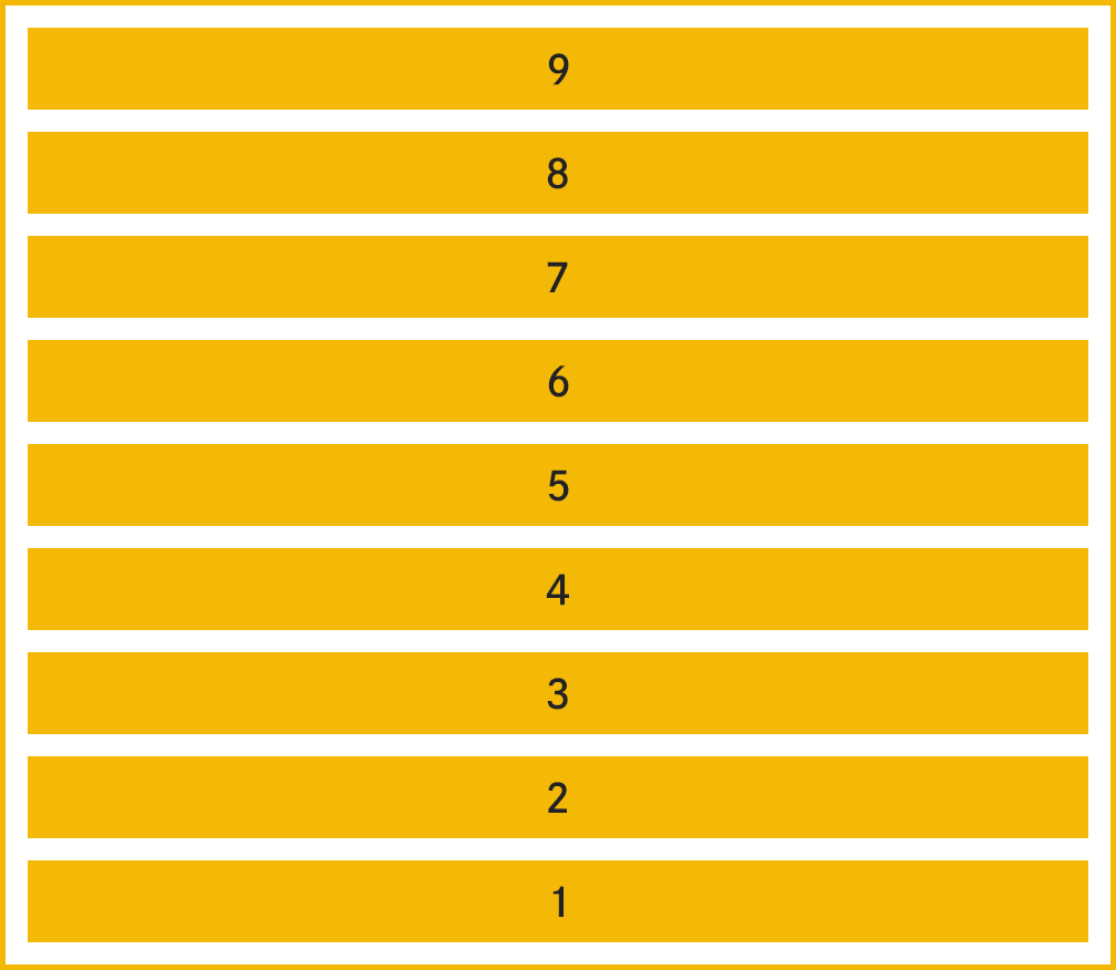
}パターン11 逆順(親要素の幅いっぱいになったら成り行き)
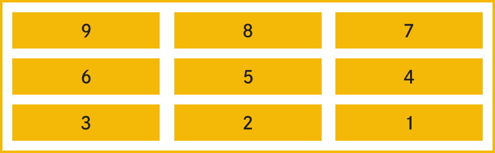
親要素に対してflex-flowプロパティでrow-reverseを指定して、フレックスアイテムを逆順に並べます。
先頭のアイテムは通常のテキストの向きと反対方向に配置され、そこから順番にアイテムが並びます。
index.html
<section>
  <article>
    <p>1</p>
  </article>
  <article>
    <p>2</p>
  </article>
  <article>
    <p>3</p>
  </article>
  <article>
    <p>4</p>
  </article>
  <article>
    <p>5</p>
  </article>
  <article>
    <p>6</p>
  </article>
  <article>
    <p>7</p>
  </article>
  <article>
    <p>8</p>
  </article>
  <article>
    <p>9</p>
  </article>
</section>
style.css
section {
  display: flex;
  margin: 0 auto;
  padding: 20px;
  width: 1000px;
  flex-flow: row-reverse;
  box-sizing: border-box;
  border: 4px solid #f2b82c;
}

article {
  margin-right: 2%;
  padding: 20px 5%;
  width: 30%;
  text-align: center;
  box-sizing: border-box;
  background: #f2b82c;
}

article:first-child {
  margin-right: 0;
}
パターン12 縦方向の並びを逆順
親要素に対してflex-wrapプロパティでwrap-reverseを指定して、フレックスアイテムを縦方向に逆順に並べます。
横方向は通常のテキストの向きと同様に並びます。
index.html
<section>
  <article>
    <p>1</p>
  </article>
  <article>
    <p>2</p>
  </article>
  <article>
    <p>3</p>
  </article>
  <article>
    <p>4</p>
  </article>
  <article>
    <p>5</p>
  </article>
  <article>
    <p>6</p>
  </article>
  <article>
    <p>7</p>
  </article>
  <article>
    <p>8</p>
  </article>
  <article>
    <p>9</p>
  </article>
</section>
style.css
section {
  display: flex;
  margin: 0 auto;
  padding: 20px 20px 0;
  width: 1000px;
  flex-wrap: wrap-reverse;
  box-sizing: border-box;
  border: 4px solid #f2b82c;
}

article {
  margin-right: 5%;
  margin-bottom: 20px;
  padding: 20px 5%;
  width: 30%;
  box-sizing: border-box;
  text-align: center;
  background: #f2b82c;
}

article:nth-child(3n) {
  margin-right: 0;
}
パターン13 横方向&縦方向の並びを逆順
パターン10のCSSに加えてflex-flowプロパティでrow-reverseを指定して、フレックスアイテムを縦方向だけでなく横方向も逆順に並べます。
index.html
<section>
  <article>
    <p>1</p>
  </article>
  <article>
    <p>2</p>
  </article>
  <article>
    <p>3</p>
  </article>
  <article>
    <p>4</p>
  </article>
  <article>
    <p>5</p>
  </article>
  <article>
    <p>6</p>
  </article>
  <article>
    <p>7</p>
  </article>
  <article>
    <p>8</p>
  </article>
  <article>
    <p>9</p>
  </article>
</section>
style.css
section {
  display: flex;
  margin: 0 auto;
  padding: 20px 20px 0;
  width: 1000px;
  flex-flow: row-reverse;
  flex-wrap: wrap-reverse;
  box-sizing: border-box;
  border: 4px solid #f2b82c;
}

article {
  margin-right: 5%;
  margin-bottom: 20px;
  padding: 20px 5%;
  width: 30%;
  box-sizing: border-box;
  text-align: center;
  background: #f2b82c;
}

article:nth-child(3n+1) {
  margin-right: 0;
}
パターン14 3の倍数の要素だけ幅いっぱい表示
フレックスアイテムのうち、3個目、6個目、9個目...と3の倍数のアイテムのみwidthプロパティを100%にすることで、やや変則的な並びにしています。
それ以外のアイテムはwidthプロパティを45%に指定しています。
index.html
<section>
  <article>
    <p>1</p>
  </article>
  <article>
    <p>2</p>
  </article>
  <article>
    <p>3</p>
  </article>
  <article>
    <p>4</p>
  </article>
  <article>
    <p>5</p>
  </article>
  <article>
    <p>6</p>
  </article>
  <article>
    <p>7</p>
  </article>
  <article>
    <p>8</p>
  </article>
  <article>
    <p>9</p>
  </article>
</section>
style.css
section {
display: flex;
margin: 0 auto;
padding: 20px 20px 0;
width: 1000px;
flex-wrap: wrap;
box-sizing: border-box;
border: 4px solid #f2b82c;
}
article {
margin-right: 10%;
margin-bottom: 20px;
padding: 20px 5%;
width: 45%;
box-sizing: border-box;
text-align: center;
background: #f2b82c;
}
article:nth-child(3n-1) {
margin-right: 0;
}
article:nth-child(3n) {
margin-right: 0;
width: 100%;
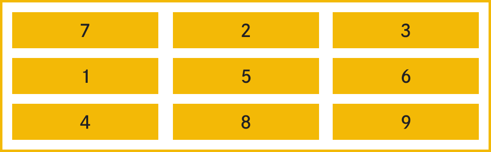
}パターン15 要素を指定した順番で並び替え
フレックスアイテムの並び順は各アイテムに対してorderプロパティで指定した順番に並び替えることができます。
orderプロパティの値は小さい順に並び、初期値は0です。
また、同じ数値のアイテムが複数あるときは先に登場したアイテムから順に並びます。
値は負の値を指定することも可能です。
index.html
<section>
  <article>
    <p>1</p>
  </article>
  <article>
    <p>2</p>
  </article>
  <article>
    <p>3</p>
  </article>
  <article>
    <p>4</p>
  </article>
  <article>
    <p>5</p>
  </article>
  <article>
    <p>6</p>
  </article>
  <article>
    <p>7</p>
  </article>
  <article>
    <p>8</p>
  </article>
  <article>
    <p>9</p>
  </article>
</section>
style.css
section {
display: flex;
margin: 0 auto;
padding: 20px 20px 0;
width: 1000px;
flex-wrap: wrap;
box-sizing: border-box;
border: 4px solid #f2b82c;
}
article {
margin-right: 3.5%;
margin-bottom: 20px;
padding: 20px 5%;
width: 31%;
box-sizing: border-box;
text-align: center;
background: #f2b82c;
}
article:nth-child(3n) {
margin-right: 0;
}
article:nth-child(1) {
order: 3;
}
article:nth-child(2),
article:nth-child(3) {
order: 2;
}
article:nth-child(4) {
order: 5;
}
article:nth-child(5),
article:nth-child(6) {
order: 4;
}
article:nth-child(7) {
order: 1;
}
article:nth-child(8),
article:nth-child(9) {
order: 6;
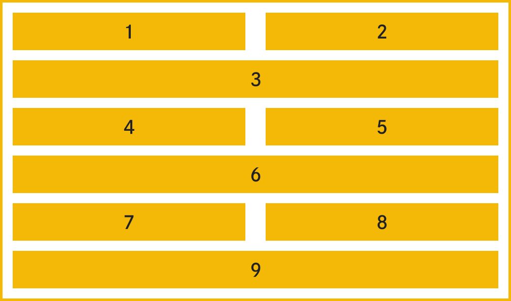
}パターン16 縦並び
フレックスアイテムの並び順は横方向のみでなく、縦方向に並べることもできます。
縦方向の並びの指定は親要素に対してflex-flowプロパティでcolumnを指定します。
index.html
<section>
  <article>
    <p>1</p>
  </article>
  <article>
    <p>2</p>
  </article>
  <article>
    <p>3</p>
  </article>
  <article>
    <p>4</p>
  </article>
  <article>
    <p>5</p>
  </article>
  <article>
    <p>6</p>
  </article>
  <article>
    <p>7</p>
  </article>
  <article>
    <p>8</p>
  </article>
  <article>
    <p>9</p>
  </article>
</section>
style.css
section {
  display: flex;
  margin: 0 auto;
  padding: 20px;
  width: 1000px;
  flex-flow: column;
  box-sizing: border-box;
  border: 4px solid #f2b82c;
}

article {
  margin-bottom: 20px;
  padding: 20px 5%;
  width: 100%;
  box-sizing: border-box;
  text-align: center;
  background: #f2b82c;
}

article:last-child {
  margin-bottom: 0;
}
パターン17 縦並び(逆順)
親要素に対してflex-flowプロパティでcolumn-reverseを指定すると、フレックスアイテムを縦方向に逆順で並べることができます。
index.html
<section>
  <article>
    <p>1</p>
  </article>
  <article>
    <p>2</p>
  </article>
  <article>
    <p>3</p>
  </article>
  <article>
    <p>4</p>
  </article>
  <article>
    <p>5</p>
  </article>
  <article>
    <p>6</p>
  </article>
  <article>
    <p>7</p>
  </article>
  <article>
    <p>8</p>
  </article>
  <article>
    <p>9</p>
  </article>
</section>
style.css
section {
display: flex;
margin: 0 auto;
padding: 20px;
width: 1000px;
flex-flow: column-reverse;
box-sizing: border-box;
border: 4px solid #f2b82c;
}
article {
margin-bottom: 20px;
padding: 20px 5%;
width: 100%;
box-sizing: border-box;
text-align: center;
background: #f2b82c;
}
article:first-child {
margin-bottom: 0;
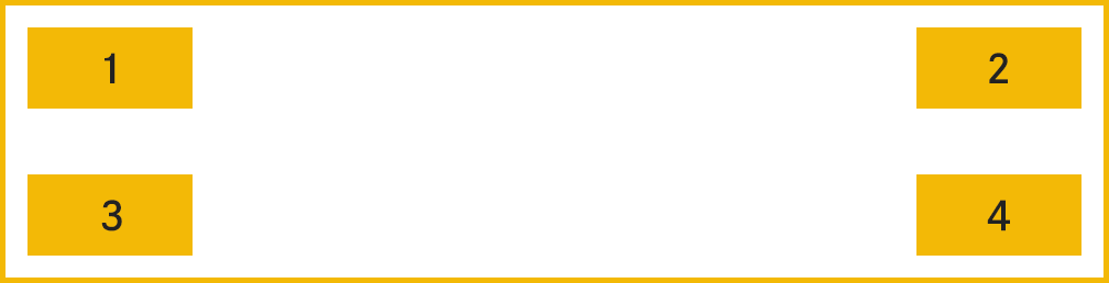
}パターン18 アイテムを上下左右4隅に配置
親要素の左上、右上、左下、右下の4隅にアイテムを配置します。
親要素ではjustify-contentプロパティで横方向、align-contentプロパティで縦方向にいずれもspace-betweenを指定して、それぞれ開始と末尾に要素が配置されるように指定します。
続いて、親要素の中に::afterを使って擬似要素を配置します。
その後、3つ以降のアイテムにorderプロパティで1を指定することで、アイテムの並び順がorderプロパティが0(初期値)である1つ目のアイテム、2つ目のアイテム、そして間に擬似要素(::after)を挟んでから3つ目のアイテム、4つ目のアイテムの順で並びます。
その並びの結果、親要素に指定していたjustify-contentプロパティとalign-contentプロパティによって4つのアイテムがそれぞれ4隅に配置されます。
index.html
<section>
  <article>
    <p>1</p>
  </article>
  <article>
    <p>2</p>
  </article>
  <article>
    <p>3</p>
  </article>
  <article>
    <p>4</p>
  </article>
</section>
style.css
section {
  display: flex;
  margin: 0 auto;
  padding: 20px;
  width: 1000px;
  height: 300px;
  flex-wrap: wrap;
  justify-content: space-between;
  align-content: space-between;
  border: 4px solid #f2b82c;
}
section::after {
  content: "";
  width: 100%;
}

article {
  padding: 20px 5%;
  width: 20%;
  box-sizing: border-box;
  text-align: center;
  background: #f2b82c;
}

article:nth-child(n+3) {
  order: 1;
}
パターン19 親要素の高さにあわせて均等配置
align-contentプロパティは親要素の高さに合わせてアイテムの縦方向の配置を均等にします。
justify-contentプロパティでは横軸の配置を調整できましたが、align-contentプロパティは縦軸の配置を調整することができます。
index.html
<section>
  <article>
    <p>1</p>
  </article>
  <article>
    <p>2</p>
  </article>
  <article>
    <p>3</p>
  </article>
  <article>
    <p>4</p>
  </article>
  <article>
    <p>5</p>
  </article>
  <article>
    <p>6</p>
  </article>
  <article>
    <p>7</p>
  </article>
  <article>
    <p>8</p>
  </article>
  <article>
    <p>9</p>
  </article>
</section>
style.css
section {
  display: flex;
  margin: 0 auto;
  padding: 20px;
  width: 1000px;
  height: 400px;
  flex-wrap: wrap;
  align-content: space-between;
  border: 4px solid #f2b82c;
}

article {
  margin-right: 5%;
  padding: 20px 5%;
  width: 30%;
  box-sizing: border-box;
  text-align: center;
  background: #f2b82c;
}

article:nth-child(3n) {
  margin-right: 0;
}
パターン20 親要素の高さにあわせて余白を調整して配置
親要素の高さに合わせて、アイテムの縦方向の余白を自動調整して配置します。
最初と最後の行は間の行間の余白の半分のサイズで自動調整されて配置します。
index.html
<section>
  <article>
    <p>1</p>
  </article>
  <article>
    <p>2</p>
  </article>
  <article>
    <p>3</p>
  </article>
  <article>
    <p>4</p>
  </article>
  <article>
    <p>5</p>
  </article>
  <article>
    <p>6</p>
  </article>
  <article>
    <p>7</p>
  </article>
  <article>
    <p>8</p>
  </article>
  <article>
    <p>9</p>
  </article>
</section>
style.css
section {
  display: flex;
  margin: 0 auto;
  padding: 0 20px;
  width: 1000px;
  height: 400px;
  flex-wrap: wrap;
  align-content: space-around;
  border: 4px solid #f2b82c;
}

article {
  margin-right: 5%;
  padding: 20px 5%;
  width: 30%;
  box-sizing: border-box;
  text-align: center;
  background: #f2b82c;
}

article:nth-child(3n) {
  margin-right: 0;
}
パターン21 縦軸の余白が均等になるように配置
親要素の高さに合わせて、アイテムの縦方向の余白を全て揃うように自動調整して配置します。
index.html
<section>
  <article>
    <p>1</p>
  </article>
  <article>
    <p>2</p>
  </article>
  <article>
    <p>3</p>
  </article>
  <article>
    <p>4</p>
  </article>
  <article>
    <p>5</p>
  </article>
  <article>
    <p>6</p>
  </article>
  <article>
    <p>7</p>
  </article>
  <article>
    <p>8</p>
  </article>
  <article>
    <p>9</p>
  </article>
</section>
style.css
section {
  display: flex;
  margin: 0 auto;
  padding: 0 20px;
  width: 1000px;
  height: 400px;
  flex-wrap: wrap;
  align-content: space-evenly;
  border: 4px solid #f2b82c;
}

article {
  margin-right: 5%;
  padding: 20px 5%;
  width: 30%;
  box-sizing: border-box;
  text-align: center;
  background: #f2b82c;
}

article:nth-child(3n) {
  margin-right: 0;
}
パターン22 アイテムを中央配置
親要素の幅と高さに合わせて、アイテムを縦軸と横軸のどちらも中央になるように配置します。
index.html
<section>
  <article>
    <p>1</p>
  </article>
</section>
style.css
section {
  display: flex;
  margin: 0 auto;
  width: 1000px;
  height: 250px;
  flex-wrap: wrap;
  justify-content: space-evenly;
  align-content: space-evenly;
  border: 4px solid #f2b82c;
}

article {
  padding: 20px 5%;
  width: 22%;
  box-sizing: border-box;
  text-align: center;
  background: #f2b82c;
}